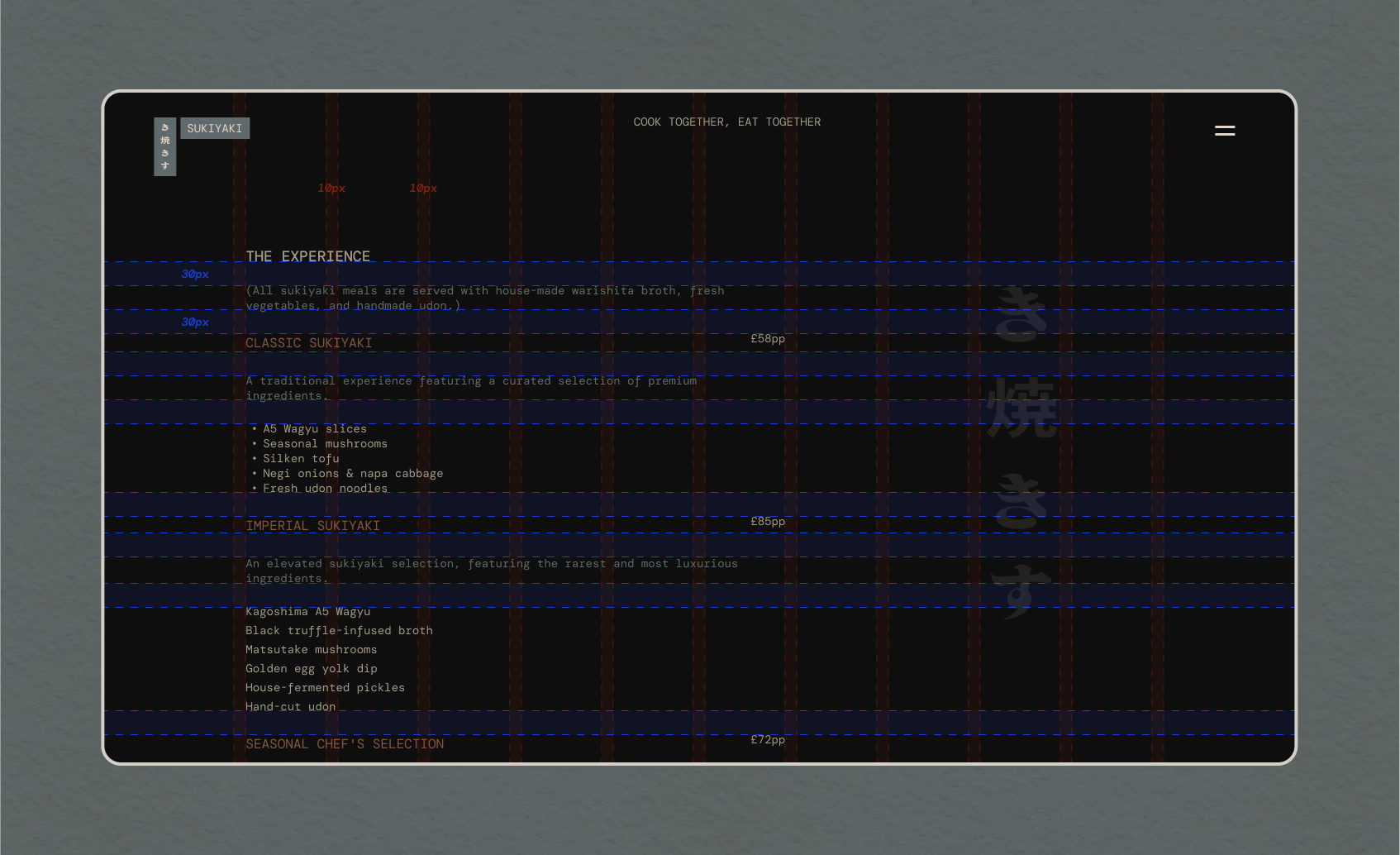
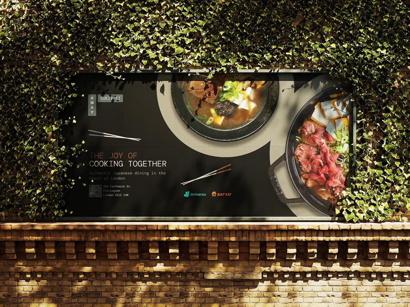
I first designed this as a concept when I was starting out. Came back to it in 2024 and treated it more like a product. Sukiyaki is a communal dish, a pot everyone cooks from at once. The identity is built on that: the meal as something shared, not something ordered.
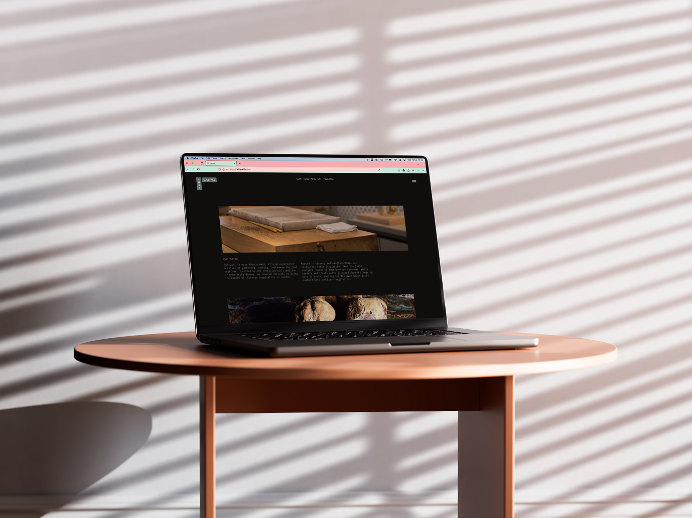
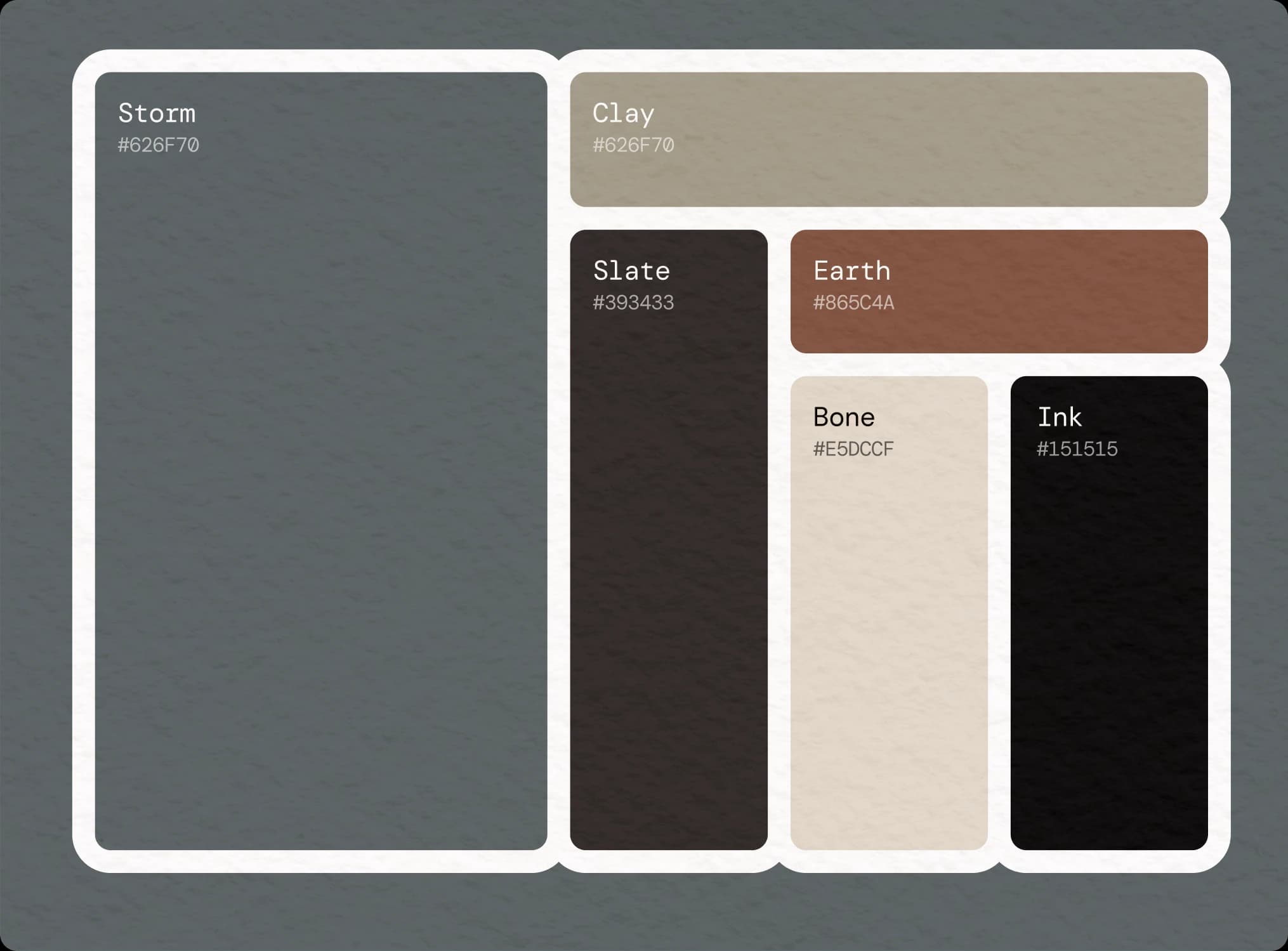
The research went into Edo-period printing and traditional palettes. What kept coming back was discipline over decoration: balance, negative space, restraint. Most hospitality sites reach for ornament and end up looking like each other. I wanted to see what happened without it.