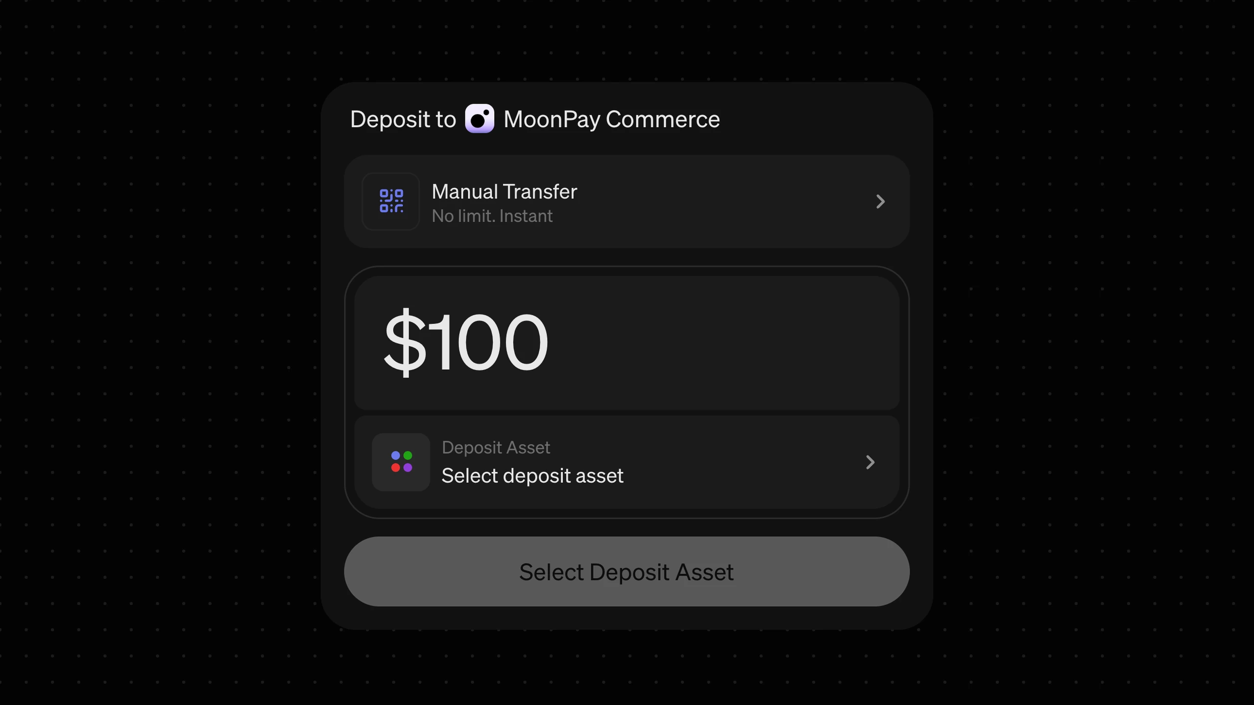
The problem
Most people depositing are repeat customers, but our flow treated every transaction as a clean slate.
The flow came with Helio Pay, a Solana checkout MoonPay acquired. It was built for crypto-native users moving crypto one transaction at a time, and it didn’t look like MoonPay, share accounts with the rest of the suite, or suit the enterprise customers MoonPay sells to.
What follows is the deposit flow in the MoonPay Commerce widget — the fastest-growing part of the Commerce business, and the reason this was worth rebuilding rather than tidying.
We were all working backwards
Every crypto deposit flow I looked at leads with intent — including ours. Most of the biggest open on a list of rails: transfer crypto, connect wallet, pay with exchange.
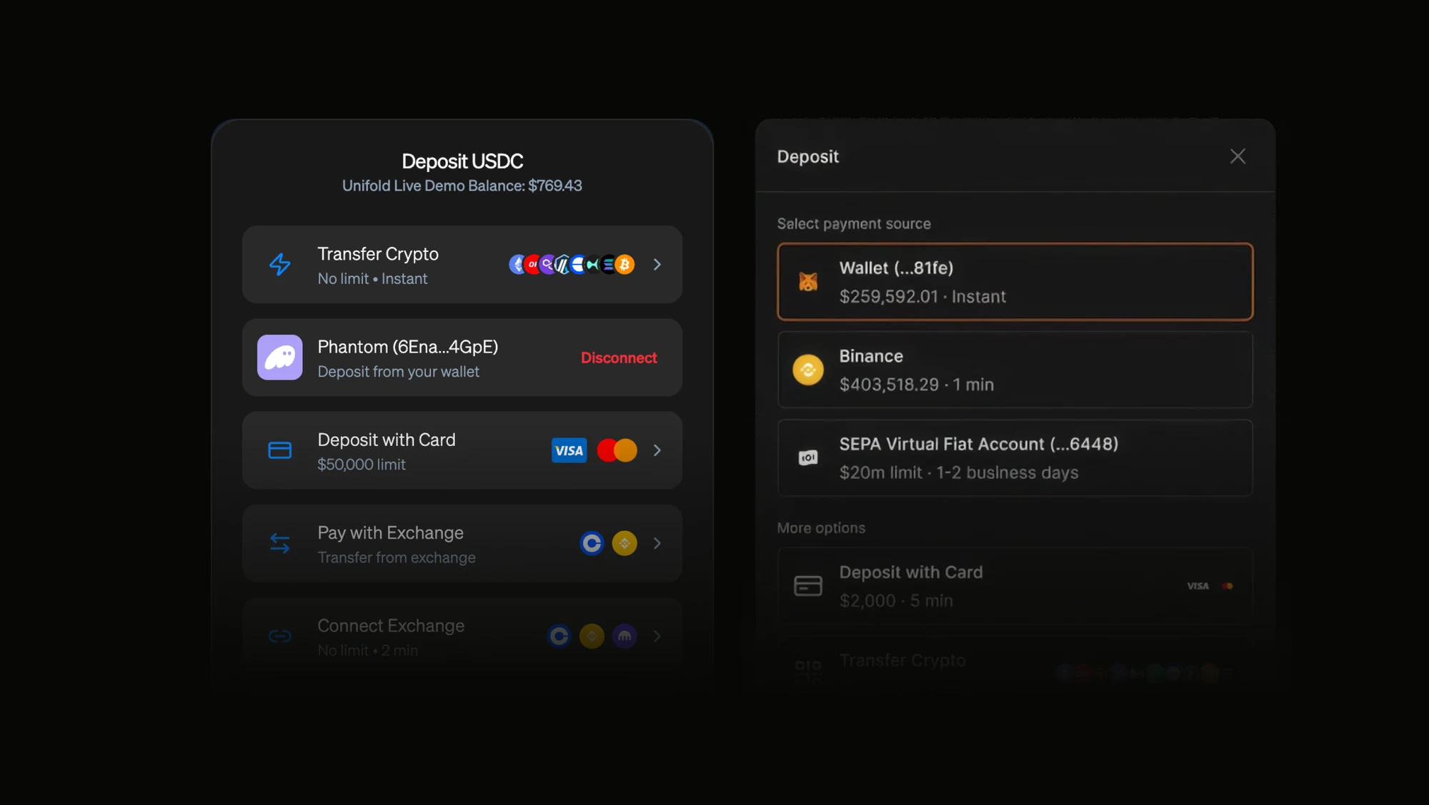
That’s a reasonable model if you treat every interaction as a brand new transaction — but it aligns with what makes sense for the transaction, not for the user.
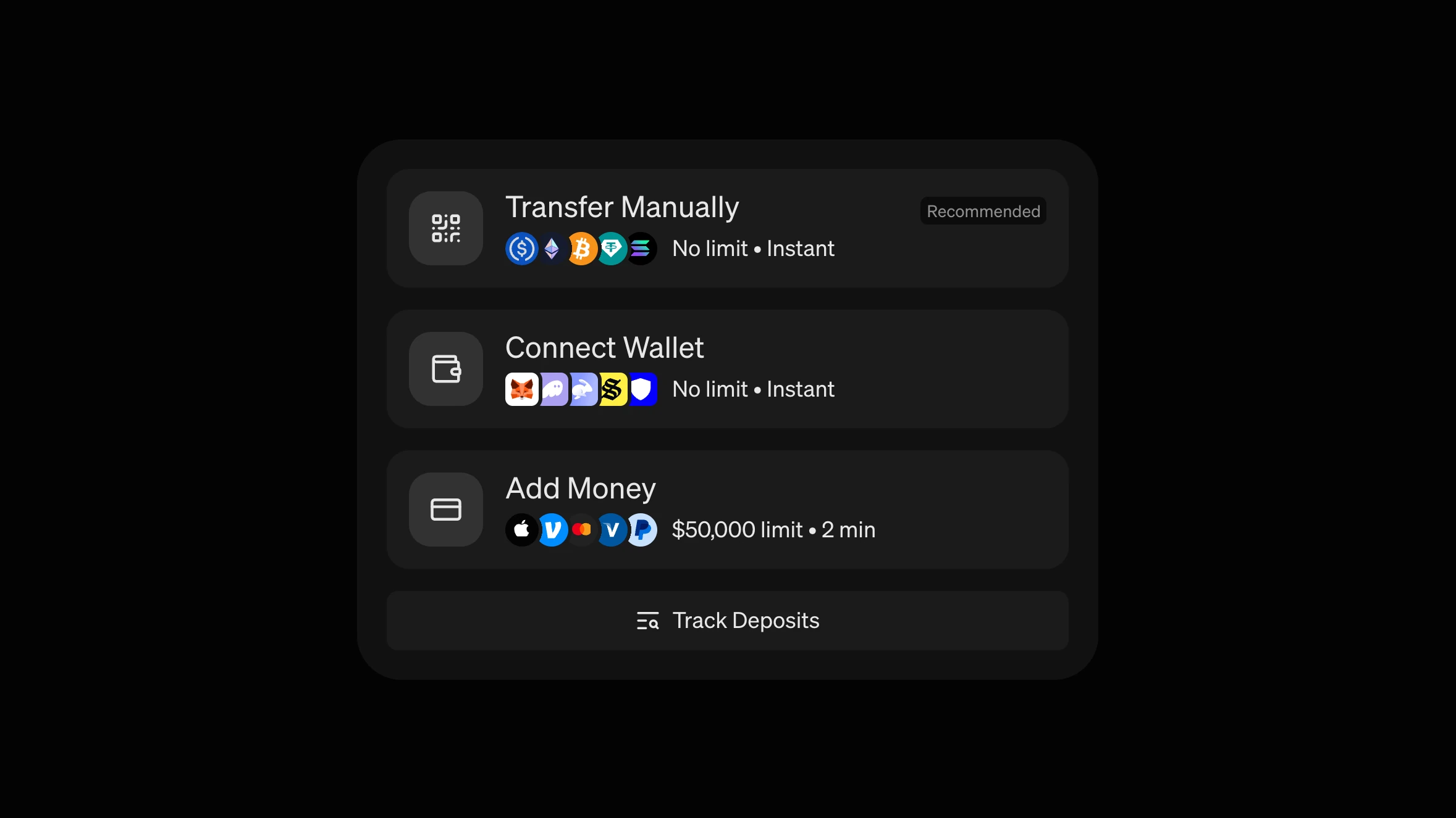
Most of our users aren’t new — I had two sources telling me the same thing.
The companies we host payments for said it directly. MoonPay Commerce powered tournament buy-ins for the World Series of Poker, where the same players come back and buy in again and again; Pump.fun runs on MoonPay Deposits, and topping up an account there isn’t a behaviour some of the users have, it’s the whole interaction model.
Our own transaction data said it more broadly — anywhere topping up is the norm, prediction markets being the obvious current example, the same accounts keep coming back.
Every one of those people was picking their payment method again, from scratch, every single time. In traditional payment flows, this was a pattern that was solved already: your card is already on file, what changes each time is how much.
The method became a setting
It took three major iterations to get there.
The first put everything on the surface: a row for crypto with wallet connect and manual transfer, a row for cash with Apple Pay, Google Pay, Venmo and bank transfer tiled across it. A rectangle full of squares.
It was great if you knew exactly what you wanted. If you didn’t, it read like a bookshelf, or a NASCAR — too many colours, nowhere obvious to look.
The second led with the amount, the way our checkout always has. You typed what you wanted to deposit, then picked a method and token from a dropdown underneath. It read well on its own, but it fell apart once fees came in. Fees vary a lot by route: landing $100 might take $102 from a wallet and $108 by card. Type the amount first and the method you pick changes the sum, so you go back and type it again. Choose the source first and you have everything you need by the time you reach the amount.
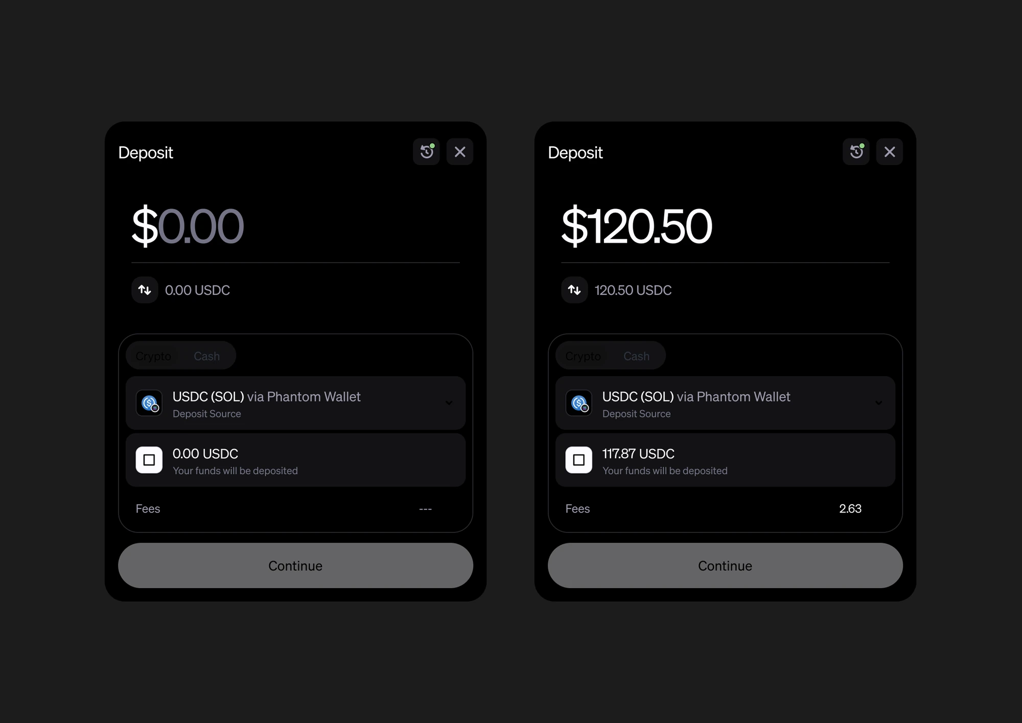
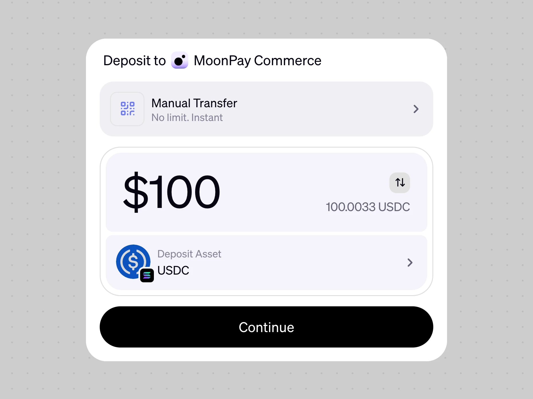
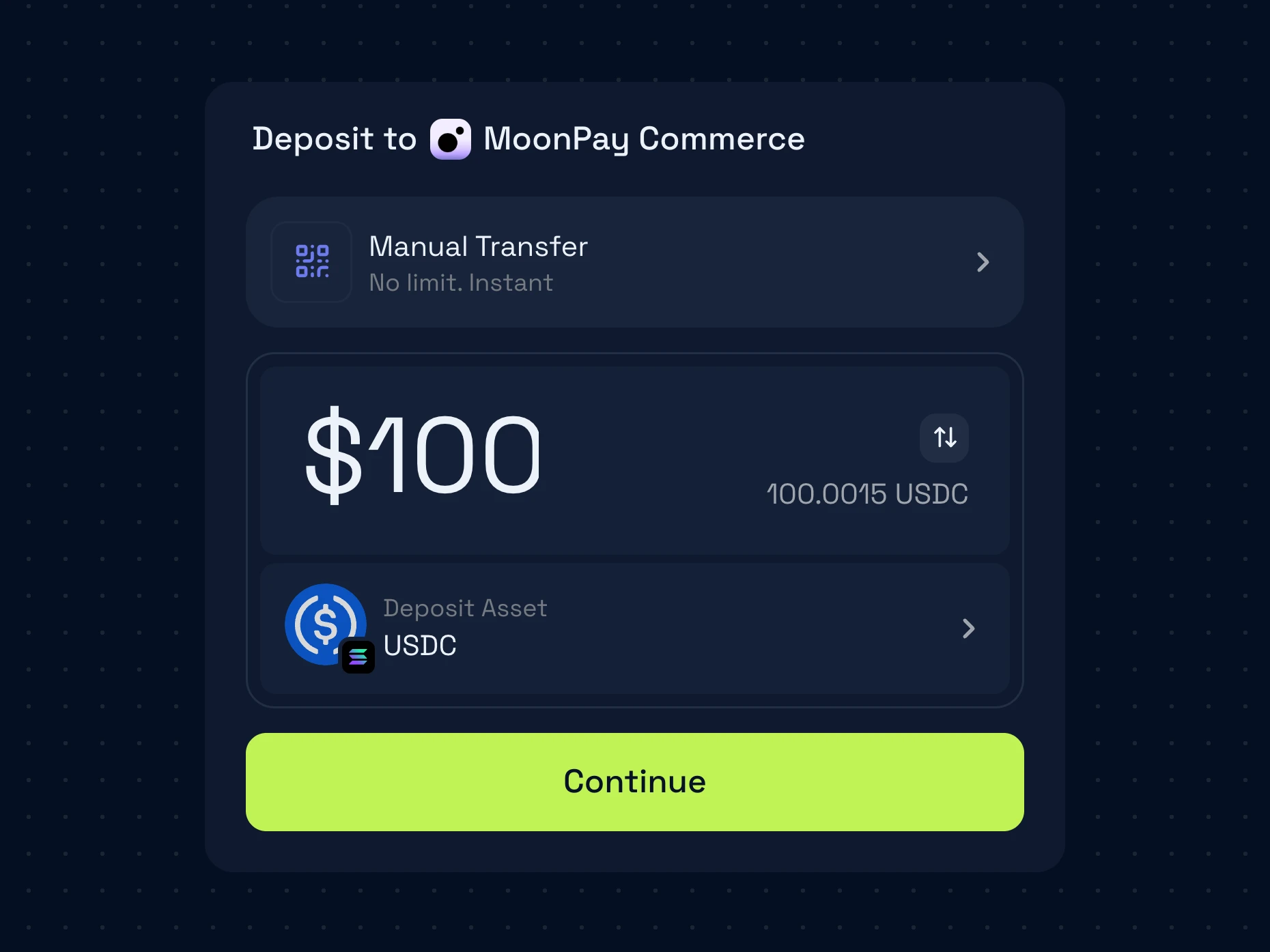
So the third keeps the amount as the focus and puts the method above it as a setting. It always has a value. New users start on Manual Transfer, because that is how most deposits come in today, and merchants can set the default to whichever method they want to prioritise. Returning users start on their last transfer — method, token, funding option — so a repeat deposit is an amount and a confirm.
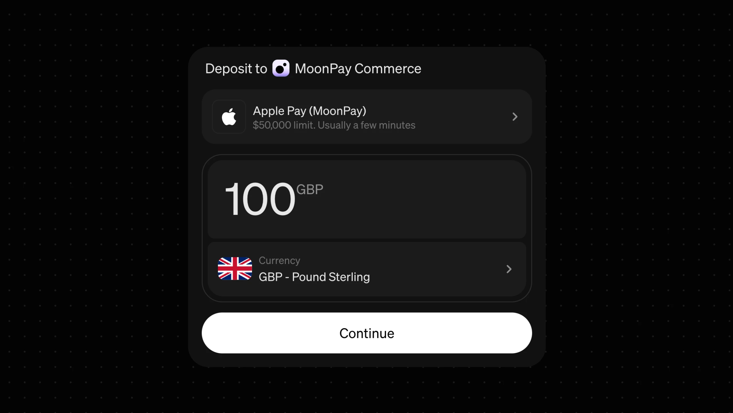
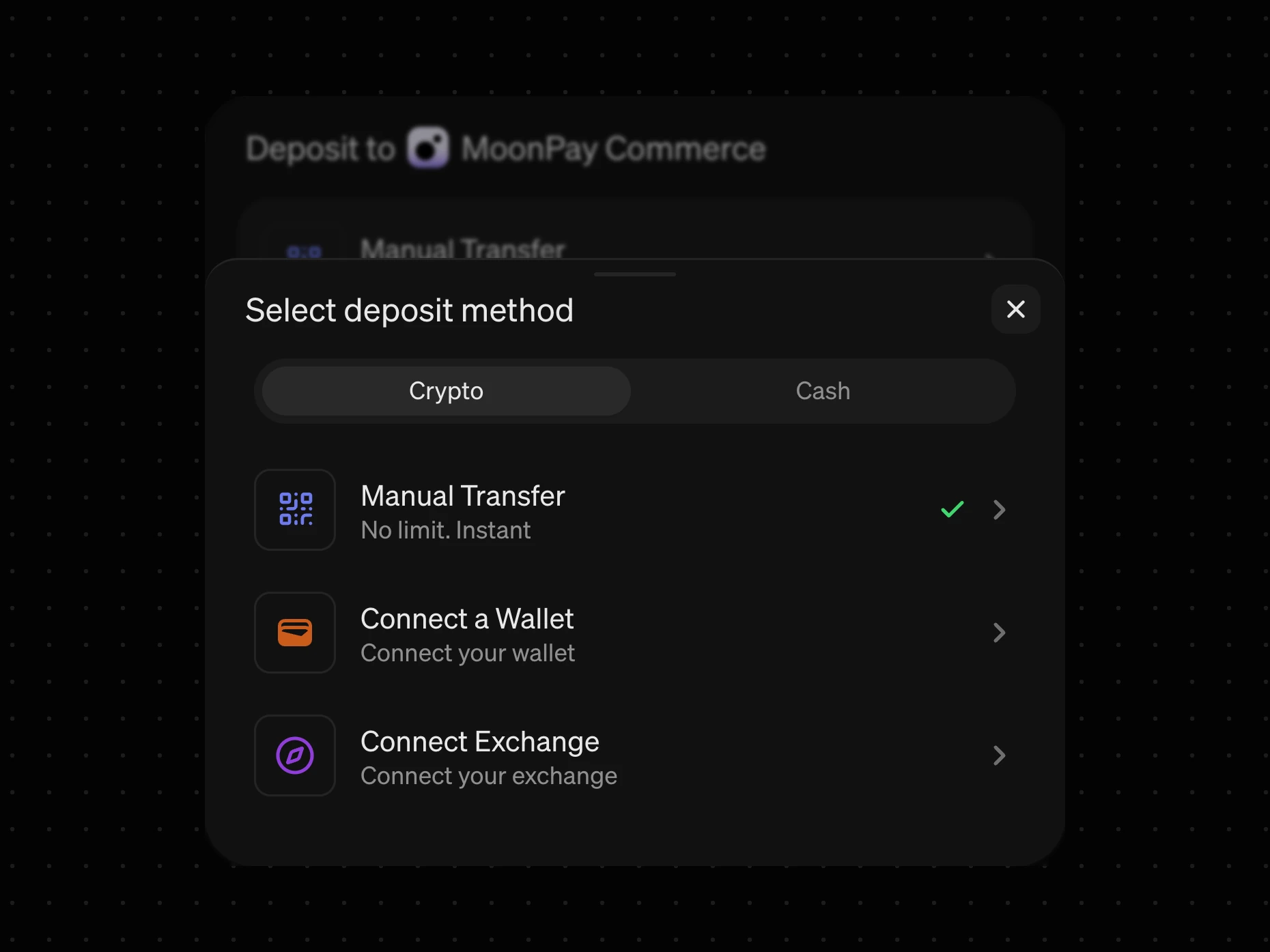
Changing anything happens in drawers. Early on I wrote down the question that decided it: wallet, network and token are all chosen in the same journey, so how do you change one without resetting everything else? A drawer opens over the config and closes back onto it, with everything else still where you left it.
One skeleton, every ending
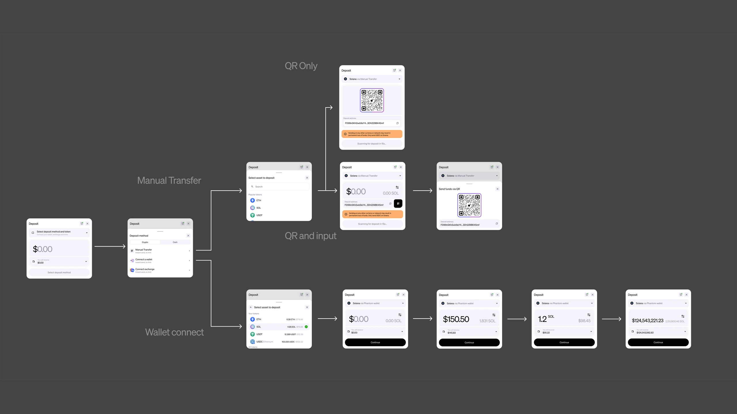
Choreographing it was the hard part. MoonPay is well kitted out — connect a wallet, connect an exchange or make a manual transfer on the crypto side; Apple Pay, Google Pay, Venmo, bank transfer, Faster Payments on the cash side. Go further and there are localised services in different regions that need to be considered. Amazing coverage, but they all end differently. Some hand you off to your phone with a QR code and finish there; others complete inside the widget whatever device you’re on. Some need a lot more information from you than others.
The config screen has to hold every one of those endings without reshaping itself each time you pick a different one. Manual transfer alone went through two versions: a QR on its own, and a QR with the amount still editable beside it.
The confirmation screen adapts per transaction type, showing only what’s relevant to that one. No ambiguity about what you’re about to sign.
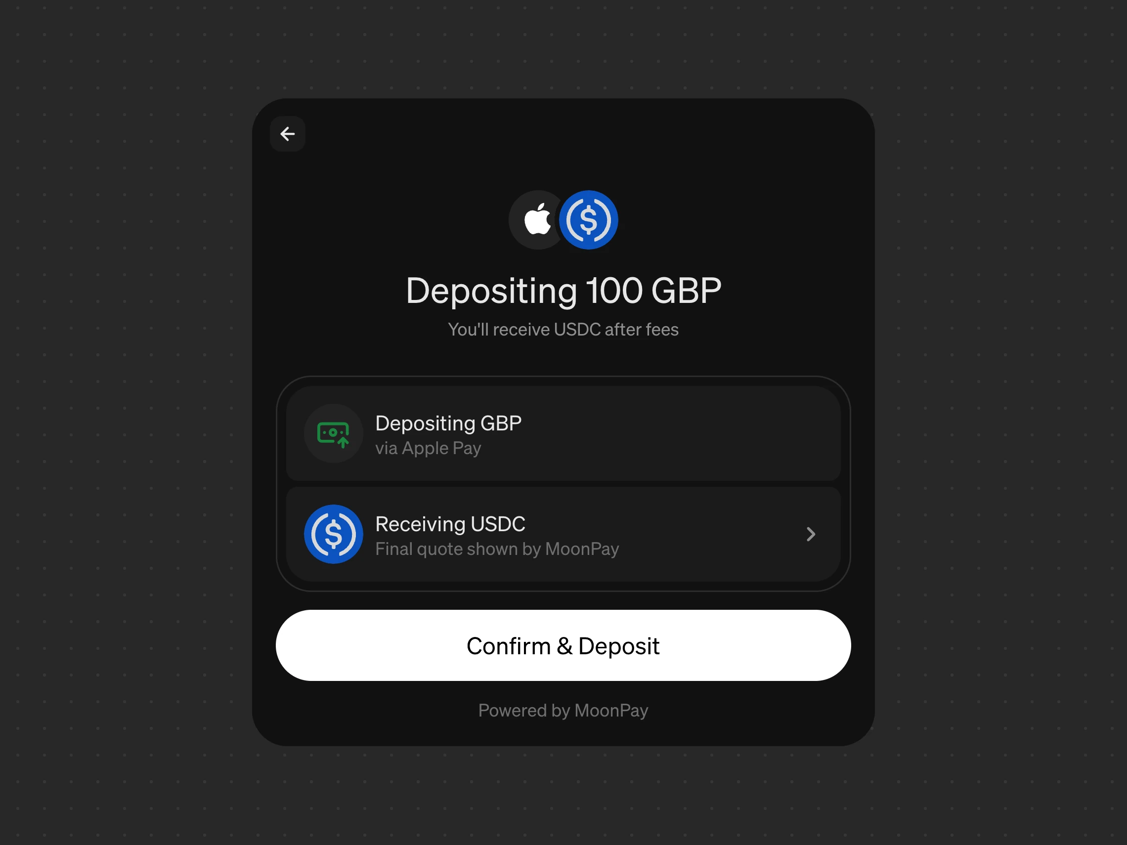
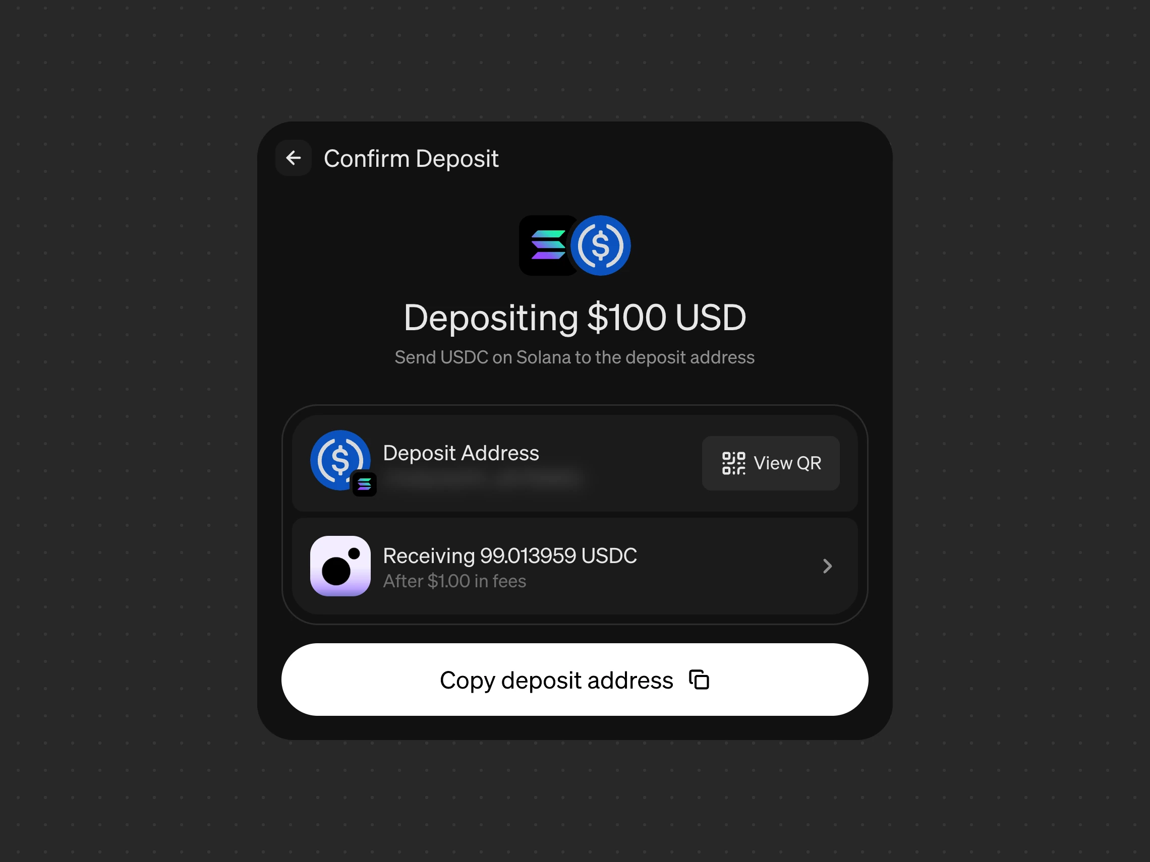
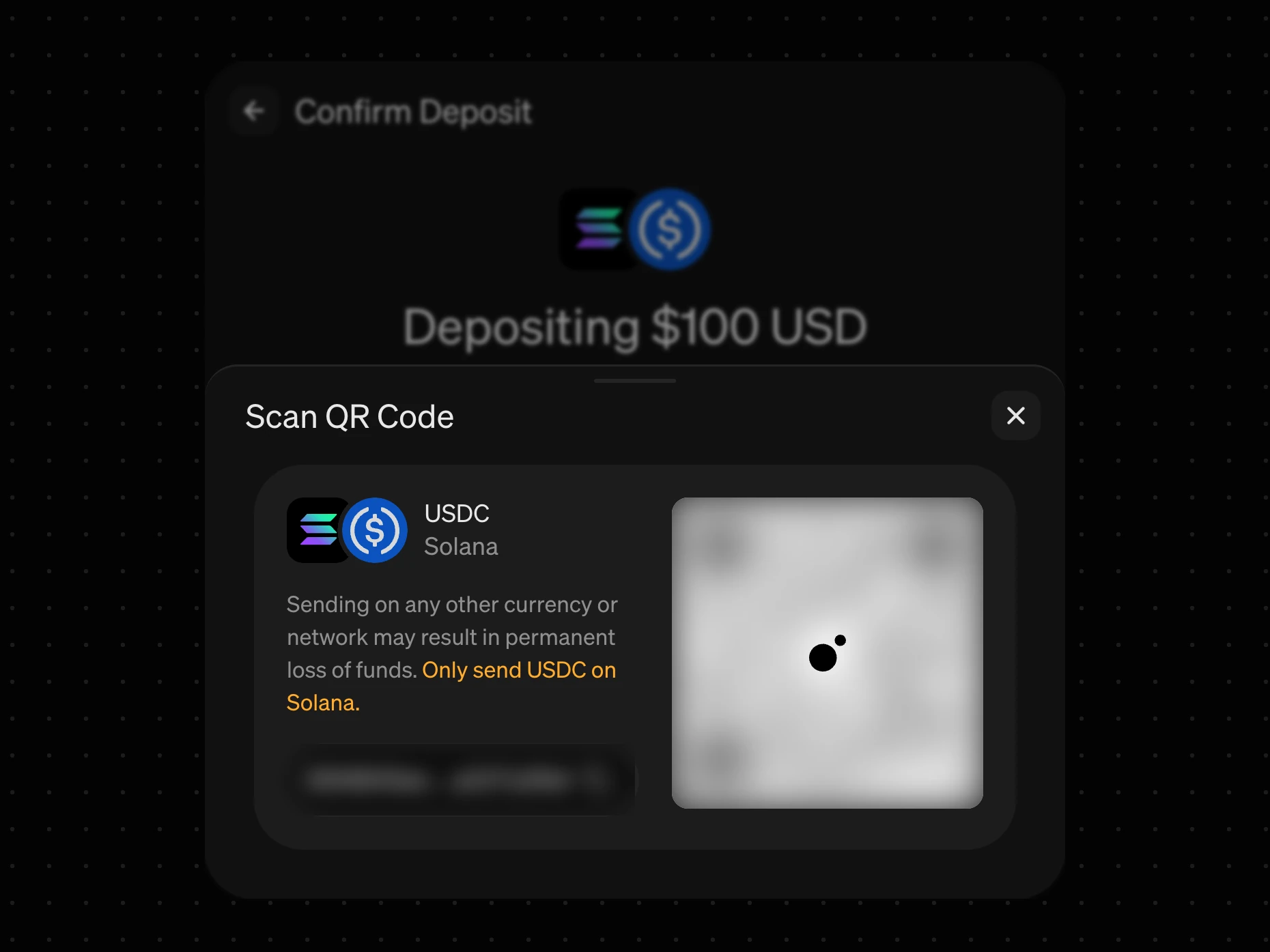
The widget has to communicate what happens next before you go. Most of the errors happen after you leave the widget, so tightening the gap between the offscreen actions and the widget is imperative. A manual transfer names the one token and network it accepts, because sending anything else can lose the funds for good, then watches the address and tells you when the deposit lands. A bank transfer is the opposite case: confirming it moves no money at all. The confirmation leads with the details you need and says plainly that the transfer is still yours to make.
Bank transfer was also the test of the skeleton. It is the slowest rail, needs the most from you and finishes entirely outside the widget, and it still fits the same config and the same confirmation.
What it cost
A setting is quieter than a list. The tile wall showed every rail at once; now you see one, and someone who has never deposited before doesn’t find out Apple Pay is there until they open the drawer. Splitting the drawer into crypto and cash makes the jump short, but it is still a jump.
We also lost the animations. We had planned motion around the config filling itself in, step by step. Once the config always had a value, there was no empty state to fill, and the motion went with it.
Built on a shared system
The deposit flow is built with Lunaris, the internal design system we built to ensure cohesion across MoonPay’s many products.
The same config, drawers and confirmation can fork into the consumer app’s widget or a withdrawal widget and behave the same way. Different instances, meant for different customers, can have a different flavour whilst obviously remaining MoonPay — which is what one product with one set of patterns actually means.
The same goes for partners. This is a partner product, so it’s a kind of faux white label — it has to be unmistakably MoonPay and disappear into someone else’s UI at the same time.
Where it stands
Two things will tell me whether I got this right. The first is whether new users find the rail they came for behind the drawer — that is the trade I chose, and it is the one most likely to be wrong. The second is the QR handoff, because it is the ending we control least, and the one most able to make an otherwise coherent flow feel like it stopped halfway. Finding the right level of guiding will be an iterative process now it’s live.