Diversification you had to do by hand
In 2021, holding a diversified position in this market meant holding it piece by piece. Ten or more assets, a separate contract approval for each one, and a rebalance by hand every time the weights drifted away from the thing you actually wanted to own. The market moved continuously, so the work never finished. A portfolio was a maintenance job rather than a holding.
None of that cost had anything to do with the investment thesis. It was operational overhead, and it selected hard for the kind of person who enjoyed the operations — which is a small audience, and not the one the product was for. Everyone else either paid in time they did not want to spend or stayed out.

Two things made it worse. Protocols split their marketing site from their product, so the moment someone became interested they were made to switch context and start again, which broke the funnel at its narrowest point. And the interfaces they landed on were gamified — leaderboards, confetti, numbers that flashed. Every one of those signals says "this is a game" to an audience deciding whether to trust something with money.
So the brief I set was this: make a genuinely volatile instrument feel as manageable as a savings account, without misrepresenting a single thing about the risk. The second half of that sentence is what made it a design problem rather than a marketing one.
One switch
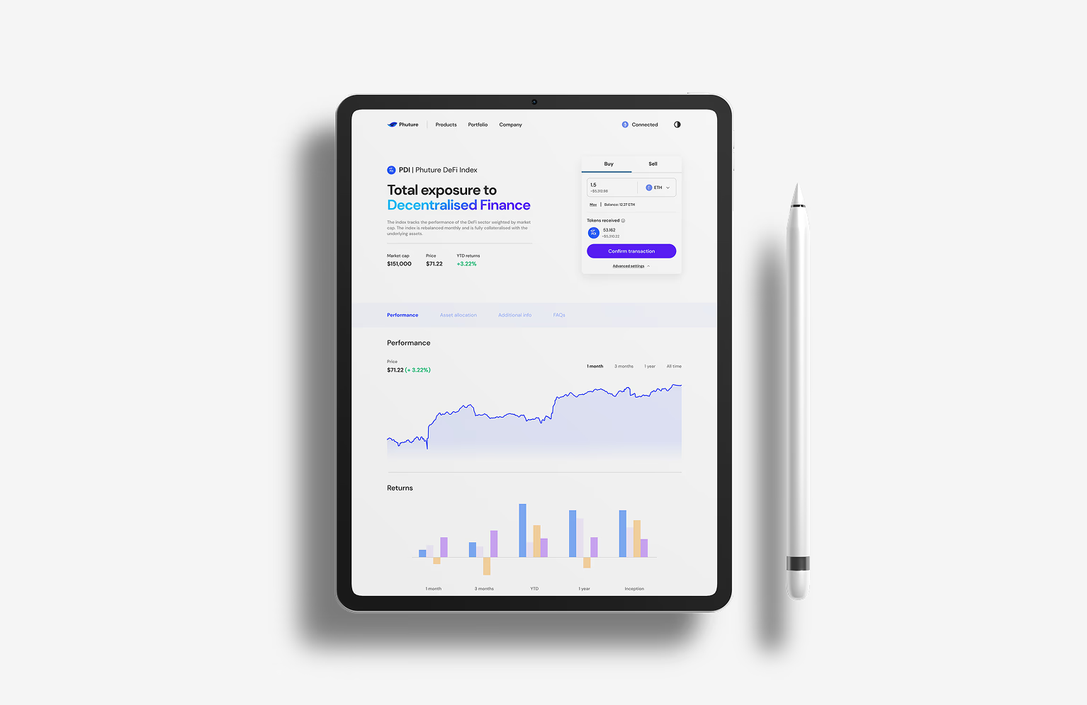
Underneath, buying a single unit of the index fired a basket of swaps and contract interactions. The design decision was to show none of it. The interface presents one product to buy, one number that matters, and one action.
That meant moving the interface's attention off the constituents — AAVE, UNI, COMP, and the rest of the basket — and onto the product itself. Decision fatigue is roughly proportional to the number of things a person believes they are supposed to have an opinion about, and the entire pitch of an index is that you are buying the decision not to have those opinions. An interface that keeps listing the holdings hands them back.

Rebalancing followed the same rule inverted. The index rebalanced monthly, and every version of that event was framed as value delivered rather than action required: something that happened for you, reported afterwards, never a task sitting in a queue. It is the difference between a fund telling you it rebalanced and a wallet telling you it needs you.
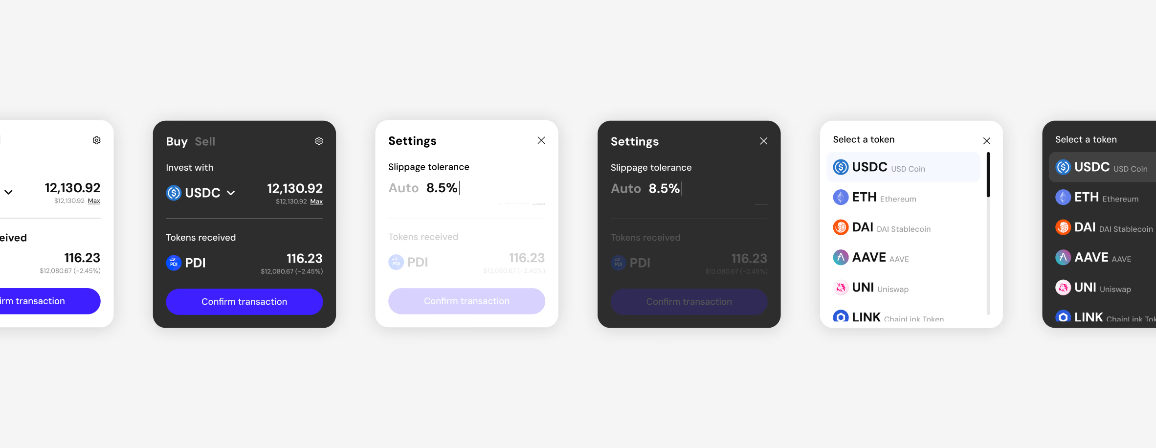
The trade-off is real and the people on the wrong side of it are the loudest. Abstraction costs control, so the controls stayed — the asset you paid with, slippage tolerance, the rest of it — one layer down, behind a gear. Clean default path, escape hatch present, and the escape hatch designed properly rather than dumped in a settings screen. What it tested was whether retail investors would trade granular control for a one-click position, and they did.

- Held on the platform, post-launch, in a bear market
- $8M+Held on the platform, post-launch, in a bear market
- Approvals to hold a diversified position
- 10+ → 1Approvals to hold a diversified position
Hide the mechanism, expose the data
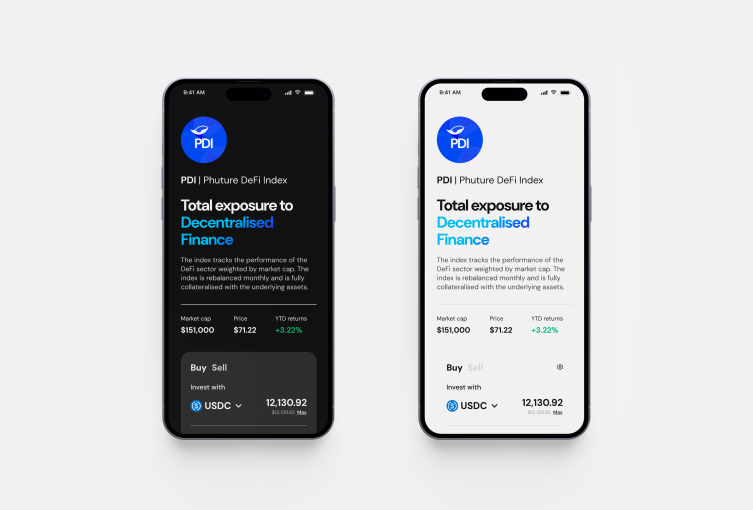
Hiding the plumbing creates an obvious risk: a product nobody can see into is asking to be taken on faith, and this audience had been burned by exactly that. So the rule was one-directional. The mechanics were hidden; the data was not.
Composition, weights and fees were stated on the surface rather than linked to a document — the things a sceptical reader goes looking for, put where they were looking. Transparency was doing competitive work as well as ethical work: the products this was up against were the ones that did not survive that question.
The visual language pushed the same way. Balanced layouts, generous spacing, a muted palette, quiet type. The reference point was a bank rather than a game, and it separated the product from the gamified set at a glance, before anyone read a word of it.

The charts mattered more than any of that. Analytics were designed to emphasise long-term movement rather than micro-volatility — candlesticks make a five-minute move look like an event, and a person shown an event will act on it. Damping that down is the single change most responsible for the retention figure, because the behaviour it suppressed was panic selling.
- Average retention, well above the category
- 211 daysAverage retention, well above the category
One system, more than one product
The system had to outlive the first index, and design systems are only ever proven by the second thing. It was architected so that additional products — a second index, then yield products — could launch without renegotiating the core navigation, which took new vehicles from a quarter to a few weeks.
The other half of that was teaching. An interface that hides its mechanism explains nothing by itself, so concepts like weighting and yield were explained in place, at the point of use, rather than in documentation nobody opens. Someone could get through the whole product without reading anything, and still learn what they owned if they wanted to.
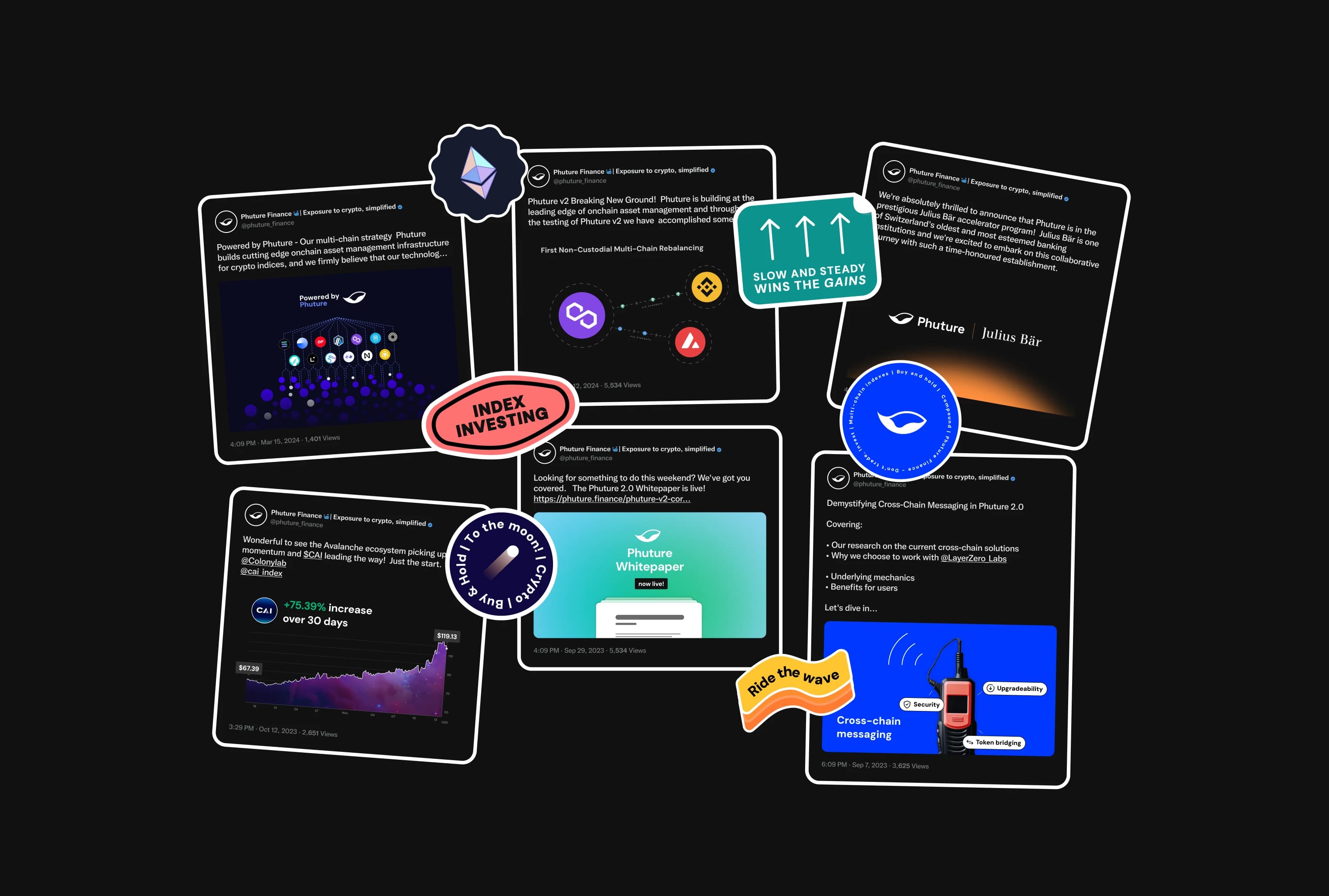
- Community growth, 7k to 15k, on content rather than incentives
- 114%Community growth, 7k to 15k, on content rather than incentives
The decision I would take furthest is the transparency work. It was scoped as a trust device, and it turned out to be the thing the most valuable users read first — and it was still the least designed surface in the product when I left. The thing I would do differently is the first run. We leaned on tooltips to carry a job that needed a real explanation up front, and a holder who never quite learns what they own is a holder who sells on the first bad week. The retention number says that mostly worked; it does not say it could not have been better.